The formula for a ‘better everyday life’ begins with Select Medical…
It’s a fact that as a civilisation we are living longer, but good health and your well-being isn’t just about living longer. It’s about living better. At Select Medical, we unlock your true health, well-being and lifestyle posibilities, allowing you to live a ‘better everyday life’.
Today, we’re pleased to introduce a new look and feel to our website that portrays our powerful message through key branding elements that visually connect visitors to Select Medical’s mission.
Here’s a quick overview of some of the primary enhancements you’ll notice:
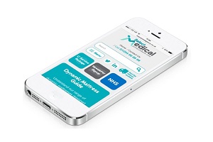 Mobile & Tablet Optimised
Put away the laptops and desktops because now you can browse with Select Medical on your mobile device. This has been long-overdue and we appreciate your patience as we’ve waited to launch this enhancement to user experience together with our rebrand.
 New Logo & Colours
Select Medical’s logo and primary colours have been updated, that you’ll see throughout the site’s new look. Our tweaked primary and brand new secondary colours help to better reflect our Honest, Caring and Expert approach to what we do and how we do things.
 C3 Logo
This icon does not replace the Select Medical logo. Instead, our “C3” will be used as a secondary branding element used in conjunction with the Select Medical logo.
C3 is what we aspire to achieve each and every day in the work we do and how we do it. We all share the responsibility to have a positive impact on people, both inside and outside of our organisation.
It’s the value of helping to create a positive outcome for everyone. People like you.
 Spots Background
The spots pattern that you see is a graphic element Select Medical will use in correlation with its visual brand. This pattern is a modern design inspired by our message of caring, innovative and experts. Each spot illustrates the many thousands of people we have helped across our care provider, carer and cared for network. They represent an important connection and convey a message of consideration, togetherness and continued growth.
Designed with a fresh look and user navigation, we will be constantly adding new content and pages to the website. What you see now is the basic concept that we are very proud of and we’re already hard at work on the next enhancements.
For those of you who want to learn more about us, dive straight to the cornerstone of our site and understand more about our C3 approach…

